搜索文档
启动 flex 布局
什么是 Flex 布局
- Flex 是 Flexible Box 的缩写,意为"弹性布局",用来为盒状模型提供最大的灵活性。
- 任何一个容器都可以指定为 Flex 布局。
- 行内元素也可以使用 Flex 布局。
- 设为 Flex 布局以后,子元素的
float、clear和vertical-align属性将失效。
块级元素启动 Flex 布局
css
.box {
   display: flex;
}行级元素启动 Flex 布局
css
.box {
   display: inline-flex;
}Flex 布局六大属性
flex-direction
flex-direction 属性决定主轴的方向(即项目的排列方向)
css.box { flex-direction: row | row-reverse | column | column-reverse; }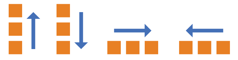
属性值:
row(默认值):主轴为水平方向,起点在左端。
row-reverse:主轴为水平方向,起点在右端。
column:主轴为垂直方向,起点在上沿。
column-reverse:主轴为垂直方向,起点在下沿。
flex-wrap
默认情况下,项目都排在一条线(又称"轴线")上。flex-wrap 属性定义,如果一条轴线排不下,如何换行。
 css
css.box { flex-wrap: nowrap | wrap | wrap-reverse; }属性值:
nowrap(默认):不换行。

wrap:换行,第一行在上方。

wrap-reverse:换行,第一行在下方。
flex-flow
flex-flow 属性是 flex-direction 属性和 flex-wrap 属性的简写形式,默认值为 row nowrap。
属性值
css.box { flex-flow: <flex-direction> || <flex-wrap>; }
justify-content
justify-content 属性定义了项目在主轴上的对齐方式。
css.box { justify-content: flex-start | flex-end | center | space-between | space-around; }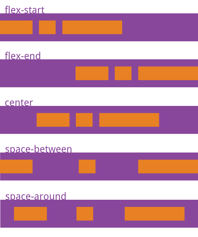
属性值:
flex-start(默认值):左对齐
flex-end:右对齐
center: 居中
space-between:两端对齐,项目之间的间隔都相等。
space-around:每个项目两侧的间隔相等。所以,项目之间的间隔比项目与边框的间隔大一倍。
align-items
align-items 属性定义项目在交叉轴上如何对齐。
css.box { align-items: flex-start | flex-end | center | baseline | stretch; }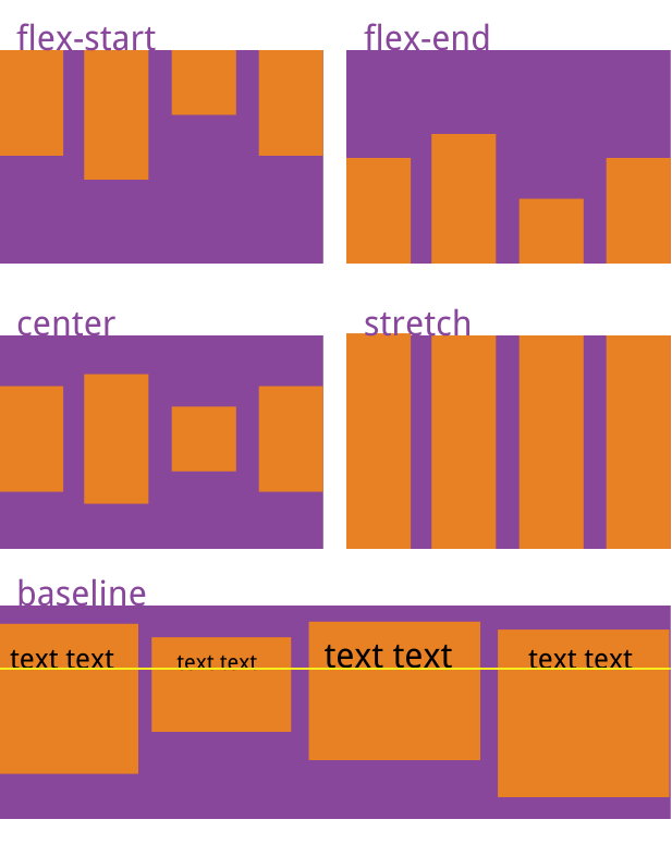
属性值:
flex-start:交叉轴的起点对齐。
flex-end:交叉轴的终点对齐。
center:交叉轴的中点对齐。
baseline: 项目的第一行文字的基线对齐。
stretch:(默认值):如果项目未设置高度或设为auto,将占满整个容器的高度。
align-content
align-content 属性定义了多根轴线的对齐方式。如果项目只有一根轴线,该属性不起作用。
css.box { align-content: flex-start | flex-end | center | space-between | space-around | stretch; }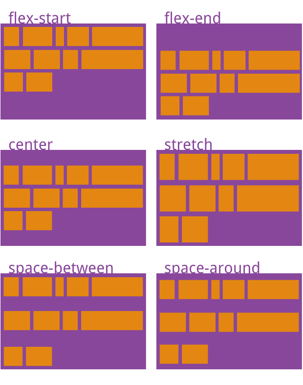
属性值:
flex-start:与交叉轴的起点对齐。
flex-end:与交叉轴的终点对齐。
center:与交叉轴的中点对齐。
space-between:与交叉轴两端对齐,轴线之间的间隔平均分布。
space-around:每根轴线两侧的间隔都相等。所以,轴线之间的间隔比轴线与边框的间隔大一倍。
stretch(默认值):轴线占满整个交叉轴。
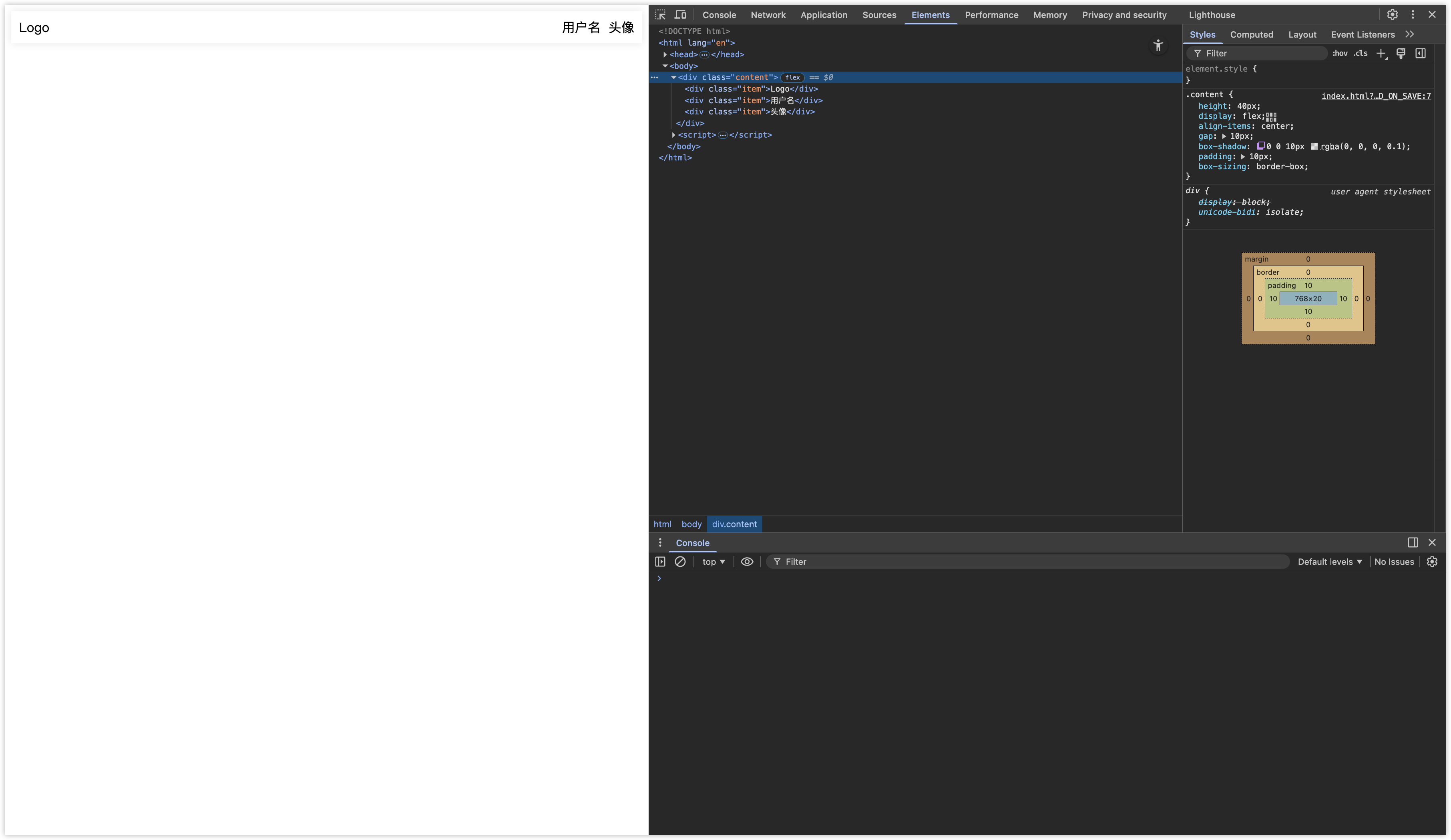
配合 margin 使用
如果像实现以下两种效果,可通过 flex + margin 实现。
标题栏效果
html
<!DOCTYPE html>
<html lang="en">
<head>
   <meta charset="UTF-8">
   <title>Title</title>
   <style>
      .content {
         height: 40px;
         display: flex;
         align-items: center;
         gap: 10px;
         box-shadow: 0 0 10px rgba(0,0,0,0.1);
         padding: 10px;
         box-sizing: border-box;
      }
      .item:nth-child(2) {
         margin-left: auto;
      }
   </style>
</head>
<body>
   <div class="content">
      <div class="item">Logo</div>
      <div class="item">用户名</div>
      <div class="item">头像</div>
   </div>
</body>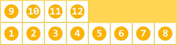
</html>网格列表效果
html
<!DOCTYPE html>
<html lang="en">
<head>
   <meta charset="UTF-8">
   <title>Title</title>
   <style>
      .content {
         display: flex;
         align-items: center;
         justify-content: space-between;
         flex-wrap: wrap;
         gap: 10px;
         box-shadow: 0 0 10px rgba(0,0,0,0.1);
         padding: 10px;
         box-sizing: border-box;
      }
      .item {
         width: 24%;
         text-align: center;
         line-height: 100px;
         background-color: #409EFF;
         color: #FFF;
         border-radius: 8px;
      }
      .item:last-child {
         margin-right: auto;
      }
   </style>
</head>
<body>
   <div class="content">
      <div class="item">Item1</div>
      <div class="item">Item2</div>
      <div class="item">Item3</div>
      <div class="item">Item4</div>
      <div class="item">Item5</div>
      <div class="item">Item6</div>
      <div class="item">Item7</div>
      <div class="item">Item8</div>
      <div class="item">Item9</div>
      <div class="item">Item10</div>
      <div class="item">Item11</div>
      <div class="item">Item12</div>
      <div class="item">Item13</div>
      <div class="item">Item14</div>
      <div class="item">Item15</div>
   </div>
</body>
</html>当然,Grid 可以实现网格布局,详情请看:Grid 布局